If your blacks look gray or dull, it’s often due to improper ink formulations, insufficient layering, or poor substrate choices. Creating rich black involves combining black with small amounts of cyan or magenta to deepen the tone, ensuring consistent ink density, and selecting the right paper or coating. Proper calibration and file preparation help prevent dull blacks. Keep exploring to learn how to consistently achieve deep, vivid blacks that truly stand out in your prints.
Key Takeaways
- Ensure proper ink layering and saturation, using rich black formulas like 60% black with CMY for depth.
- Use high-quality, coated paper to improve ink holdout and prevent blacks from appearing dull.
- Calibrate printers and color separations regularly to maintain consistent, deep black reproduction.
- Avoid over-inking; adjust ink density carefully to prevent smudging and achieve rich, vibrant blacks.
- Test and refine rich black mixes on sample sheets before production to ensure optimal depth and color richness.
Why Do Blacks Look Dull or Gray in Print?

Have you ever noticed that blacks sometimes appear dull or gray when printed? This happens because of insufficient color saturation in your ink layering. When you don’t layer enough black ink, the printed result lacks depth, causing the black to look washed out or faded. Standard black ink may not provide enough pigment density, so the printed black doesn’t stand out sharply. Instead, it appears dull because the light reflects off the paper surface, reducing contrast. Proper ink layering ensures the black ink is dense and rich, improving color saturation. Without enough ink, your print won’t have the depth needed for a true black. Achieving the correct rich black formula and paying attention to ink layering and ensuring maximum saturation helps produce black that’s bold, deep, and visually striking. Additionally, understanding color management techniques can help maintain consistent black tones across different print runs. Proper ink layering techniques are essential for enhancing the rich black effect, making your prints more vibrant and professional.
What Is Rich Black and How Does It Differ From Standard Black?
Rich black combines multiple ink colors to create a deeper, more intense black than standard black. You’ll notice differences in composition, which affect how the ink appears on the page. This variation can lead to a more striking visual impact in your printed materials. Additionally, understanding color mixing techniques can help optimize the use of rich black for different printing projects.
Composition Differences Explained
Ever wondered how different black inks can impact print quality? The composition of rich black differs from standard black mainly in ink layer and color depth. Rich black combines multiple inks to create a deeper, more intense black, enhancing visual impact. Standard black uses a single black ink, resulting in a thinner ink layer and less vibrancy. When you choose rich black, you’re layering cyan, magenta, yellow, and black inks to increase ink density, producing a richer hue. This increased ink layer boosts color depth and ensures your prints look bold and uniform. Additionally, understanding color mixing techniques can help you achieve more precise and vibrant black tones in your printing projects. Incorporating print color management practices can further improve consistency across different print runs. Keep in mind these key points:
- Rich black uses multiple inks for depth
- Standard black relies on a single ink
- Ink layer influences overall richness
- Color depth affects visual impact
- Composition determines print quality
Furthermore, awareness of ink layer composition can assist in troubleshooting color issues and achieving desired results.
Visual Impact Variations
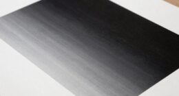
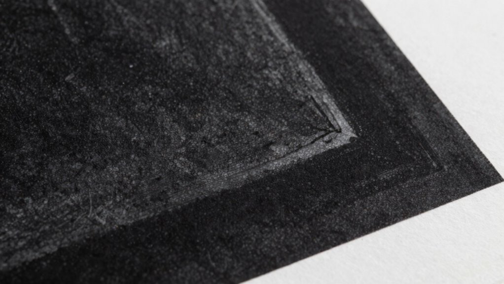
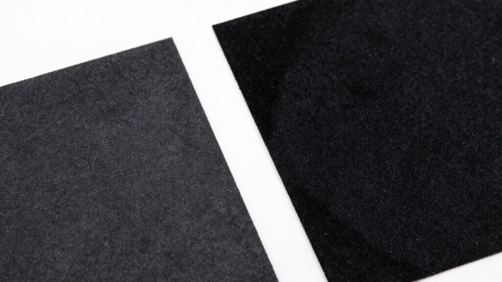
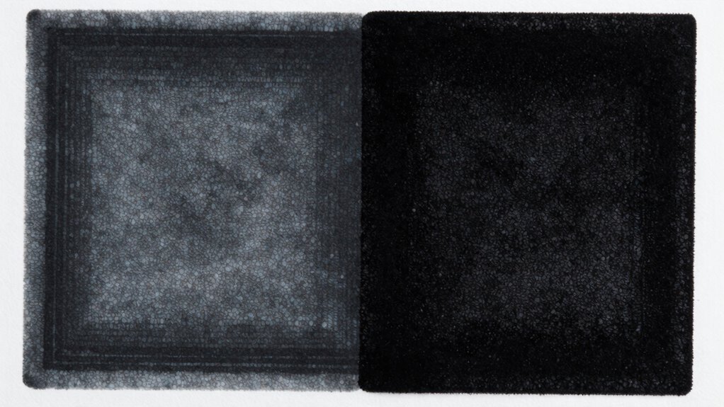
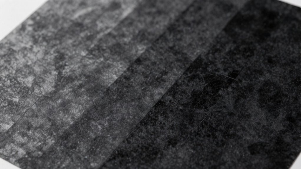
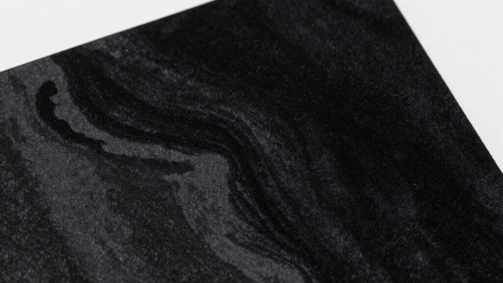
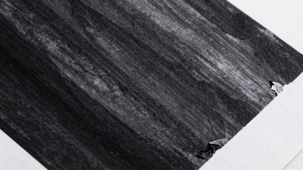
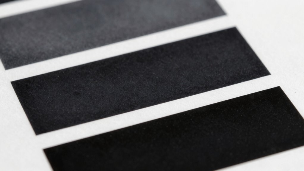
Understanding the visual impact of black inks is essential for achieving striking print results. Rich black offers a deeper, more intense appearance than standard black, but its impact varies based on ink absorption and paper texture. On smooth paper, rich black appears vivid and uniform, enhancing contrast. However, on textured or porous paper, ink absorption can cause the black to look dull or grayish, reducing its visual punch. Standard black may seem less vibrant but maintains consistency across different paper types. Recognizing these variations helps you choose the right black formulation for your print project. Adjusting ink density and considering paper texture ensures your blacks look rich and impactful, whether you aim for a bold statement or subtle shading. Additionally, understanding ink absorption properties helps optimize the final visual effect of your print. Being aware of color consistency across different media can further improve the overall appearance of your printed blacks. Incorporating printing techniques that account for these factors can also enhance the durability and vibrancy of your black inks over time, especially when using advanced color management methods to maintain uniformity.
Common Printing Problems That Cause Gray Blacks

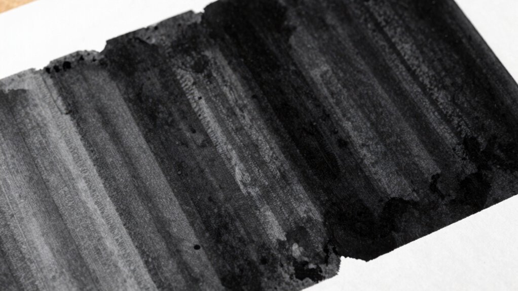
Gray blacks often result from issues like inadequate color separation, low ink density, or poor color management. When these problems occur, your prints can look dull and lack depth. Addressing these factors is key to achieving the rich, true black you want. Additionally, improper ink mixing or contamination can also contribute to undesirable gray tones in your blacks, emphasizing the importance of proper color management practices. Ensuring effective requirements traceability can help identify and resolve color inconsistencies throughout the printing process, leading to more consistent results.
Inadequate Color Separation
Inadequate color separation is a common culprit behind gray blacks in print. When your color calibration isn’t accurate, the printer struggles to distinguish between black and other hues, resulting in dull, muddy blacks. Poor ink formulation can also cause issues, producing inconsistent density and uneven coverage. To improve, focus on:
- Ensuring proper color calibration before printing
- Using ink formulated specifically for rich blacks
- Adjusting ink density levels for maximum contrast
- Separating color channels correctly during prepress
- Regularly testing separation quality for consistency
Low Ink Density Levels
Low ink density levels can substantially contribute to dull, gray blacks in your print output. When the ink density is too low, less ink is deposited on the paper, which reduces color saturation and results in a lackluster, flat appearance. This often happens when the printer is set to a lighter setting or if the ink calibration isn’t optimized. Insufficient ink coverage prevents the deep, rich blacks you desire, making images appear washed out or gray instead of vibrant black. To fix this, check your printer settings and increase the ink density for black or rich black mixes. Proper calibration ensures consistent ink flow, boosting color saturation and delivering deeper, more vivid blacks that truly stand out in your print pieces.
Poor Color Management
Have you ever noticed that your blacks look dull or muddy despite using the right ink? Poor color management often causes this issue. It happens when color calibration isn’t precise or when substrate selection isn’t suitable for your print job. To fix this, consider these factors:
- Regularly calibrate your monitor and printer for consistent color output
- Choose substrates that enhance color vibrancy and contrast
- Use color profiles tailored to your printer and substrate combination
- Avoid mixing incompatible inks or materials
- Perform test prints before final runs to catch color inaccuracies
- Understanding color profiles can help ensure your colors stay consistent across devices and media.
How Ink Composition Affects Vivid Black Printing
The composition of ink plays an essential role in achieving a vivid black for print, as different ingredients influence color depth, richness, and consistency. Your ink formulation determines how well the black appears on paper, relying heavily on the right balance of pigments. Higher pigment concentration generally results in deeper, more opaque blacks, but too much can cause issues like uneven coverage or drying problems. Conversely, too little pigment produces duller, grayish blacks. The key is optimizing the pigment concentration to maximize color vibrancy without sacrificing print quality. Additionally, the choice of pigments affects how well the ink adheres and resists fading. Understanding ink formulation helps you produce richer, more vivid blacks that truly stand out in your print work. Proper formulation also ensures consistent color reproduction, which is vital for maintaining brand accuracy and professional presentation. Furthermore, selecting the right pigment types can enhance durability and resistance to environmental factors. The type and quality of pigments used can also influence the ink’s resistance to fading, ensuring longevity of the printed material. To achieve optimal results, it’s also important to consider printing techniques that complement your ink formulation and enhance overall print quality.
How to Create the Perfect Rich Black Mix for Printing
Creating a rich black mix that stands out in your prints involves carefully blending different inks to achieve the perfect balance of depth and vibrancy. Start with proper color calibration to guarantee consistent ink density. Pay close attention to paper selection, as smoother, coated papers can enhance black richness. To create the ideal mix, consider these tips:
- Use a standard blend like 60% K (black) and 40% C, M, Y for deep blacks
- Adjust ink ratios based on paper surface and print conditions
- Test on sample sheets before final printing
- Maintain consistent color calibration throughout production
- Focus on high-quality inks for uniform coverage
- Understanding color calibration is essential for achieving consistent and vibrant black tones across all prints
- Remember that ink mixing techniques can significantly influence the final appearance of your rich black
- Additionally, print environment factors such as humidity and temperature can affect ink drying and appearance, so controlling these conditions is beneficial. Proper print setup ensures that your black remains rich and consistent from start to finish.
This approach ensures your rich black maintains vibrancy without looking flat or gray, regardless of the paper type.
Design Tips for Achieving Deep, Vivid Blacks in Your Files
To achieve deep, vivid blacks, start by using proven rich black formulas in your files. Be sure to adjust ink percentages carefully to avoid muddying the color or causing printing issues. Test your files on multiple substrates to make sure your blacks stay rich and consistent across different surfaces.
Use Rich Black Formulas
Achieving rich, deep blacks in your print files isn’t just about selecting black; it requires using specific black formulas that blend multiple ink colors. These formulas enhance color depth and reduce grayness, resulting in a more vibrant, uniform black. To get the best results, consider these tips:
- Use formulas like Rich Black (C100 M0 Y0 K100) for maximum depth
- Combine black with a touch of cyan or magenta to improve ink layering
- Avoid over-saturating with too many colors to prevent muddy blacks
- Test different formulas to see which yields the deepest hue in your printer
- Remember that consistent ink layering builds a uniform, vivid black across your print
Applying the right formulas ensures your blacks stay rich and vibrant, avoiding dull, grayish tones.
Adjust Ink Percentages Carefully
Adjusting ink percentages precisely is essential for producing deep, vivid blacks that stand out in print. When you fine-tune ink mixing, you ensure the right balance of cyan, magenta, yellow, and black (CMYK) for a rich, uniform black. Avoid overloading ink, which can cause smudging or drying issues, or under-inking, which results in dull, grayish blacks. Proper color calibration helps you monitor how your file translates to print, making sure your black values are consistent and vibrant. Use software tools to preview and tweak ink percentages before printing. Remember, small adjustments can make a significant difference, so always review your settings carefully. Precise control over ink mixing and calibration guarantees your blacks stay deep, avoiding that dull, gray appearance.
Test on Multiple Substrates
Have you ever noticed how a black that looks perfect on one substrate appears dull or inconsistent on another? Testing on multiple substrates reveals how different materials affect your black’s appearance. Variations in substrate compatibility and ink absorption properties can cause shifts in tone and vibrancy. To guarantee your blacks stay rich and vivid across all surfaces, consider these tips:
- Test on a variety of paper types and coatings
- Observe how ink absorption affects depth and gloss
- Adjust your color build-up based on substrate feedback
- Use proofing materials similar to your final print medium
- Document color performance for future reference
Preparing Files for Rich Black: Best Practices

To guarantee your rich black appears vibrant and consistent in print, it’s essential to prepare your files correctly. Focus on proper color mixing by combining black with other CMY inks—typically 60% cyan, 40% magenta, 40% yellow, and 100% black—to achieve a deeper, richer tone. Adjust ink density to prevent over-inking, which can cause smudging or longer drying times. Use high-resolution images and embed color profiles to ensure color accuracy across devices. Avoid excessive use of multiple colors in black areas; sticking to a well-defined rich black formula maintains consistency. Properly preparing your files with these best practices minimizes color shifts and ensures your rich black looks bold and uniform in the final print.
Troubleshooting Black Quality Issues During Printing
Even when your files are perfectly prepared, printing black areas can still encounter issues that affect the final look. Color calibration plays a crucial role in ensuring your printer produces true blacks without grayness or dullness. Incorrect calibration can cause inconsistencies, leading to uneven coverage or muddy blacks. Substrate selection also impacts black quality; a smooth, compatible surface helps achieve richer, more uniform blacks. To troubleshoot black quality issues:
- Verify your printer’s color calibration regularly
- Use the right substrate for your print job
- Check ink levels and replace low or clogged nozzles
- Adjust print settings for ideal ink density
- Conduct test prints to identify persistent issues
Addressing these factors can help you achieve deeper, more consistent blacks in your printed materials.
How to Maintain Consistent Black Quality Across Prints
Maintaining consistent black quality across prints requires careful attention to your printing process and regular adjustments. Start with proper color calibration to ensure your monitor and printer are aligned, which helps achieve uniform blacks. Consistently review and adjust your calibration settings so that your output remains accurate over time. Additionally, focus on ink formulation; using the right combination of black inks and ensuring they are properly mixed prevents color shifts and dullness. Regularly test print samples to monitor black consistency, making small tweaks whenever you notice deviations. Keeping your equipment clean and calibrated, combined with optimized ink formulation, ensures your blacks stay rich, deep, and uniform across every print job. This disciplined approach guarantees reliable, high-quality results every time.
Final Tips for Getting Deep, Vivid Blacks Every Time
Achieving deep, vivid blacks consistently requires paying close attention to your printing setup and ink choices. Focus on optimizing your ink formulation and color mixing to ensure rich, uniform blacks. To improve results:
- Use a well-balanced black ink with proper pigment concentration
- Adjust color mixing by adding small amounts of cyan or magenta to deepen the black
- Calibrate your printer regularly for consistent ink flow and color accuracy
- Experiment with different ink formulations to find one that produces the darkest, most vivid black
- Maintain proper paper type and coating to enhance ink absorption and vibrancy
Frequently Asked Questions
Can Paper Type Affect the Appearance of Rich Black?
Yes, paper type affects how rich black appears. A paper’s texture and ink absorption play key roles; smooth, coated paper reflects ink better, resulting in a deeper black, while textured or uncoated paper absorbs more ink, causing blacks to look dull or gray. You’ll notice that choosing the right paper enhances the richness of your black ink, making your print look more vibrant and professional.
What Are the Environmental Factors Influencing Black Print Quality?
Environmental factors are the silent puppeteers of print quality. You should watch humidity levels, as high humidity can cause ink adhesion issues, leading to dull blacks. Too little moisture makes prints look patchy or faded. Maintaining proper humidity control keeps the paper and ink in harmony, ensuring your blacks stay deep and vibrant. Think of it as tending a garden—balance is key to flourishing print quality.
How Does Printing Press Calibration Impact Black Consistency?
Your printing press calibration directly impacts black consistency by ensuring proper ink density and color balance. When you calibrate the press correctly, you control how much ink is applied, preventing blacks from appearing dull or gray. Regular calibration helps maintain uniform ink density across prints, resulting in rich, deep blacks. Without proper calibration, inconsistent ink density can cause blacks to look washed-out or uneven, affecting overall print quality.
Are There Digital Tools to Preview Rich Black Before Printing?
Yes, you can use digital previews to see how rich black will look before printing. These tools offer color simulation, allowing you to preview your design’s blacks and verify they appear deep and vibrant. By checking the digital preview, you can make adjustments early, avoiding dull or gray blacks in the final print. This proactive step helps you achieve consistent, rich blacks that match your expectations.
How Do Different Printing Methods Alter Black Vibrancy?
Different printing methods impact black vibrancy through ink density and color profiling. Offset printing typically produces richer blacks with higher ink density, while digital printing may result in slightly duller blacks due to lower ink coverage. Color profiling helps optimize black tones for each method, guaranteeing consistent vibrancy. Adjusting ink density and using accurate color profiles ensure your blacks stay deep and vibrant across various printing techniques.
Conclusion
To achieve deep, vivid blacks every time, think of your print as a canvas waiting to be filled with rich, velvety darkness. When you master the right mix and prepare your files carefully, your blacks will pop with life, avoiding dull, gray shadows. With each print, you’re painting a bold, flawless image—trust your process, tweak your ratios, and let your blacks shine with the depth and vibrancy they deserve.