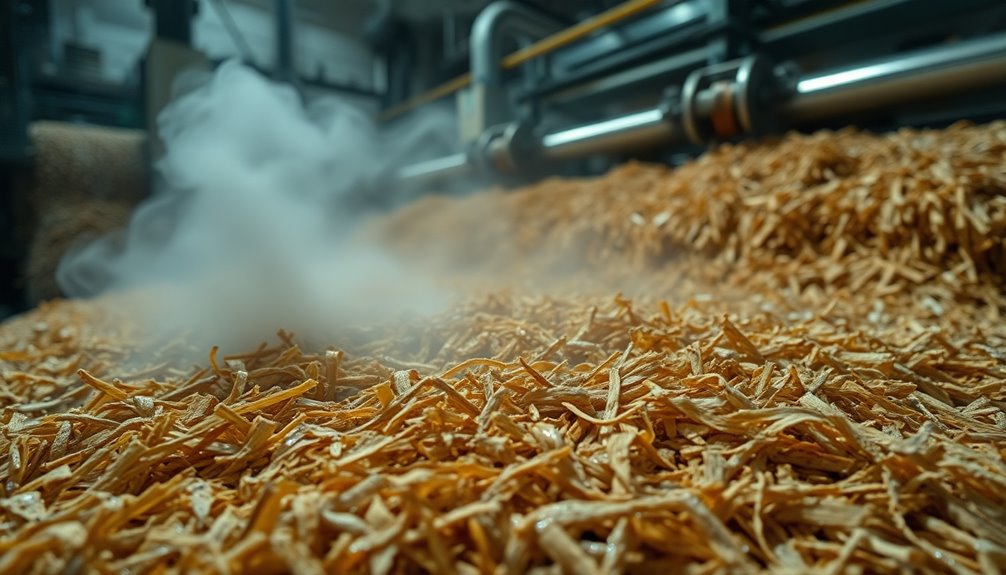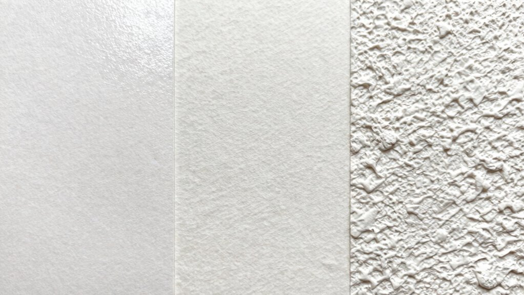

Beyond hot press and cold press, watercolor papers differ in texture, weight, and composition. Heavier papers, like 300 lb, resist warping during washes, while lighter ones are more flexible but may need stretching. The fiber content affects durability and how the paper interacts with paint. Manufacturing quality also influences consistency and strength. These variations impact your artwork’s look and longevity. Stick around, and you’ll discover how these factors can help you choose the perfect paper for your style.

Get business pricing on monitors, keyboards and dev gear
- Business-only prices and quantity discounts
- Tax-exempt purchasing
- Multiple users, one account, clear invoices
Key Takeaways
- Textured papers add depth and bold strokes, while smooth papers allow for fine, detailed work.
- Paper weight affects water absorption and warping; heavier papers resist buckling during washes.
- Fiber content and manufacturing influence durability, absorption, and suitability for different techniques.
- Archival and acid-free qualities ensure long-term preservation and prevent deterioration over time.
- Surface quality impacts paint interaction, with textured surfaces creating unique effects compared to smooth ones.
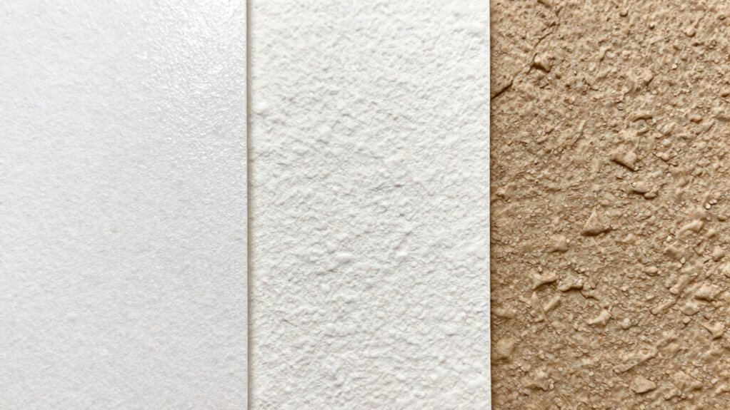
Have you ever wondered which watercolor paper best suits your painting style? Beyond the basic choices of hot press and cold press, there’s a whole world of differences that can influence your work’s outcome. One key factor to evaluate is paper texture. Textures range from very smooth to highly textured surfaces, each offering a distinct painting experience. Smooth papers, often hot press, allow for fine, detailed work and sleek washes, making them ideal if you prefer crisp lines and delicate blending. On the other hand, rough or cold press papers have a more pronounced texture that can add character and depth to your paintings, especially when working with bold strokes or textured techniques. The texture influences how paint interacts with the surface—more textured papers absorb water differently and can create unique effects that smooth papers can’t replicate. Additionally, archival quality is crucial for ensuring your artwork remains vibrant and intact over time, especially if you plan to display or sell your pieces. Choosing archival-quality paper can also provide peace of mind, knowing your work is protected against environmental factors. The paper’s archival quality can help prevent yellowing and deterioration, making your artwork more durable. Additionally, selecting papers with acid-free properties helps preserve the longevity of your artwork and prevents degradation over time. The weight of the paper also plays a role in how it performs beyond just hot or cold press. Heavier papers, such as 300 lb, resist warping and buckling, especially when working with wet washes or multiple layers. Lighter papers, like 90 lb, can be more flexible and easier to handle, but may require stretching or mounting to prevent curling. Moreover, understanding the fiber content of the paper can influence its durability and how it reacts to different painting techniques. It’s also important to consider the manufacturing process, as it affects the paper’s overall quality and consistency. Ultimately, your choice depends on your style and the type of effects you want to achieve.
Frequently Asked Questions
How Does Paper Weight Affect Watercolor Painting Techniques?
Your watercolor paper weight influences your painting technique by affecting water absorption and paper stiffness. Thicker paper, like 300 lb, has a denser fiber composition and a slower water absorption rate, allowing you to layer and lift paint easily. Lighter paper, such as 90 lb, absorbs water quickly and is more flexible, which can cause warping. Adjust your approach based on the paper weight to achieve desired effects and maintain control.
Are There Environmentally Friendly Watercolor Paper Options Available?
You’ll be surprised to learn eco-friendly watercolor papers do exist! Many options use eco-friendly manufacturing processes and biodegradable materials, making your art sustainable without sacrificing quality. These papers often blend recycled fibers or plant-based fibers, proving environmentally conscious choices can still produce beautiful artwork. So, yes, you can create stunning watercolor pieces while reducing your carbon footprint—who knew saving the planet could be so artistically fulfilling?
How Does Surface Texture Influence Watercolor Color Vibrancy?
Your watercolor’s color vibrancy is directly affected by surface texture and absorbency. A smoother surface with less absorbency allows colors to sit on top longer, making them more vivid. In contrast, textured papers with higher absorbency absorb more water and pigment, often muting colors. Texture variation influences how light interacts with your pigments, impacting overall vibrancy. Choosing the right surface based on your desired effect enhances your watercolor’s brightness and depth.
Can Watercolor Papers Be Reused or Recycled Effectively?
Think of watercolor paper as a canvas of memories, waiting to tell new stories. You can reuse or recycle watercolor papers effectively by employing recycling techniques like tearing into smaller pieces for mixed media or cleaning and drying them for future use. Reuse methods include sketching over dried paint or creating layered textures. With care, your watercolor papers can live multiple artistic lives, reducing waste and inspiring fresh creativity.
What Are the Best Storage Practices for Watercolor Papers?
You should store watercolor papers in a cool, dry place, keeping them flat or upright in a sturdy portfolio or storage box to prevent warping. Make sure the papers are acid-free and archival quality, which helps preserve their color and integrity over time. Use paper sizing to prevent warping and bleeding, and consider placing a sheet of acid-free tissue paper between sheets to avoid sticking or damage.
Conclusion
As you glide your brush across different watercolor papers, you’ll notice how each surface tells its own story—smooth, glossy hot press invites delicate detail, while textured cold press adds a vibrant, gritty feel to your strokes. Think of your paper as the canvas of your imagination, shaping every splash and swirl into a masterpiece. With each choice, you craft a unique dance of water and pigment, turning simple colors into a vivid, living scene.
Fall Picks
fall essentials
As an affiliate, we earn on qualifying purchases.