ICC profiles are like digital maps that help your colors stay consistent across different devices—screens, printers, and cameras—without needing to understand all the color science behind them. They tell your software how each device reproduces colors, so your images look the same everywhere. When used correctly, these profiles prevent unwanted color shifts and mismatches. If you want simple ways to keep your colors accurate, grab the secrets behind effective color management.
Key Takeaways
- ICC profiles are like digital blueprints that help ensure colors look the same across different devices.
- They translate color data so screens, printers, and cameras interpret colors consistently.
- Proper calibration and matching profiles prevent unwanted color shifts in your work.
- Using the right ICC profile during editing and printing keeps your colors accurate and predictable.
- Regularly updating and verifying profiles simplifies managing color accuracy without needing deep science knowledge.
Why Do Colors Look Different Across Devices?
Colors can look different across devices because each one uses its own display technology, color settings, and calibration methods. Your perception of color depends heavily on how your device is calibrated, which can vary widely. Even if two screens display the same image, differences in device calibration can cause colors to appear distinct. This happens because each device interprets color data differently, influencing how you perceive hue, saturation, and brightness. Factors like screen type, aging, and factory settings also play a role in color perception. As a result, what looks accurate on one device might seem off on another. To minimize these discrepancies, proper device calibration is essential, ensuring your colors stay consistent and true to your design intentions. Understanding color matching can help you achieve more consistent results across different devices, especially when considering color calibration techniques. Additionally, being aware of display technology differences can help in choosing the right tools for your work. Recognizing how color profiles are managed across devices can further improve color consistency in your projects, as color management plays a crucial role in maintaining accurate color reproduction.
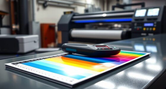
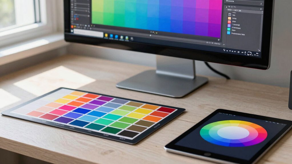
What Are ICC Profiles, and Why Are They Essential?
Have you ever wondered how devices can display consistent colors despite their differences? That’s where ICC profiles come in. They serve as a digital blueprint, ensuring accurate color calibration and device profiling. Essentially, an ICC profile describes how a device reproduces colors, allowing software to interpret and adjust colors correctly. This process guarantees that what you see on one device matches another, maintaining color integrity across screens and printers. Additionally, understanding the importance of color accuracy can help you achieve more reliable and professional results in your projects. When working with digital images, knowing how device profiling works can significantly improve your workflow quality. Key functions include: – Standardizing color reproduction – Enabling precise device profiling – Facilitating consistent color workflows – Improving color accuracy during editing and printing. Recognizing the role of color management helps you better coordinate your tools and mediums for optimal results. Proper application of ICC profiles can also help prevent issues like color mismatches, which are common when devices aren’t correctly calibrated. Without ICC profiles, colors can look mismatched or dull. They are vital for designers aiming for consistency and professional-quality results. Understanding their role helps you manage color better across various devices and mediums.
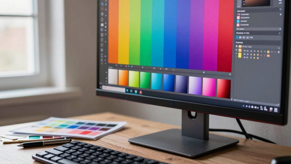
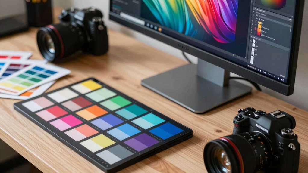
How Do ICC Profiles Keep Your Colors Consistent Everywhere?
Because each device interprets and displays colors differently, ICC profiles act as the bridge that guarantees your visuals look consistent everywhere. They enable effective color management by translating colors between your monitor, printer, and camera, ensuring uniformity. When you calibrate your devices, you create accurate profiles that reflect their true color capabilities. These profiles serve as a common language, aligning color data across various hardware and software. Proper use of color management ensures that your design intent remains intact across different media and viewing environments. Additionally, understanding color profiles helps designers troubleshoot color discrepancies and achieve precise results across different media. Implementing standardized color workflows can further enhance color consistency in professional projects.
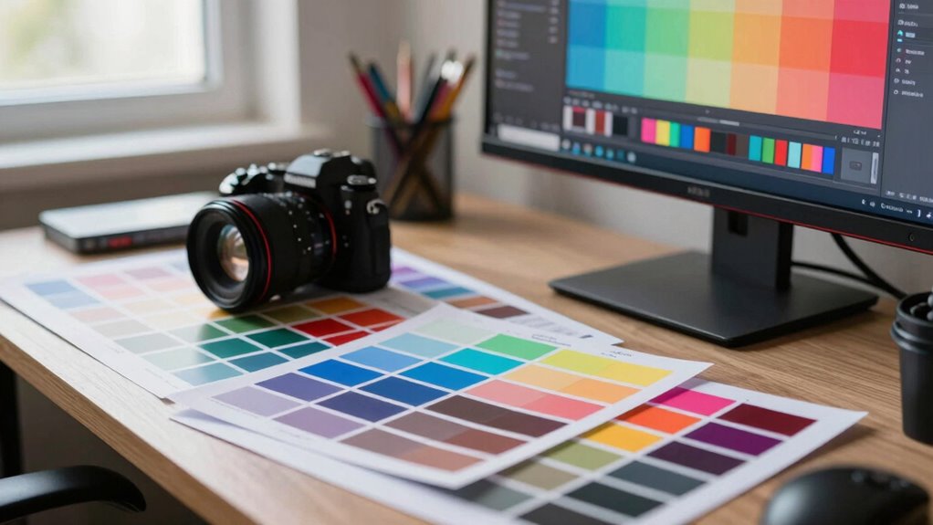
Choosing the Right ICC Profile for Your Projects
Selecting the right ICC profile is vital to guarantee your project looks its best across all devices and media. To do this, consider your target medium, color accuracy needs, and the calibration techniques you’ve used. Proper color management begins with choosing profiles aligned with your workflow, ensuring consistent results. Focus on color gamuts that match your output device, whether it’s a monitor, printer, or web display. Remember, calibration techniques like hardware calibration help maintain color fidelity. When selecting profiles, understanding color gamuts can significantly improve your choices: — matching profiles to your device’s color space — using standardized profiles for printing or web — confirming profiles are updated and compatible — considering the environment where the device operates. Additionally, being aware of color management workflows can help you streamline your process and avoid common pitfalls. Incorporating professional color calibration can also greatly enhance your color accuracy and consistency. This approach helps you achieve predictable, professional results without unnecessary complexity, especially when understanding how different ICC profiles influence the appearance of your media. Understanding color science principles further empowers you to select the most appropriate profiles for your specific needs.
How to Use ICC Profiles in Your Workflow (Step-by-Step)
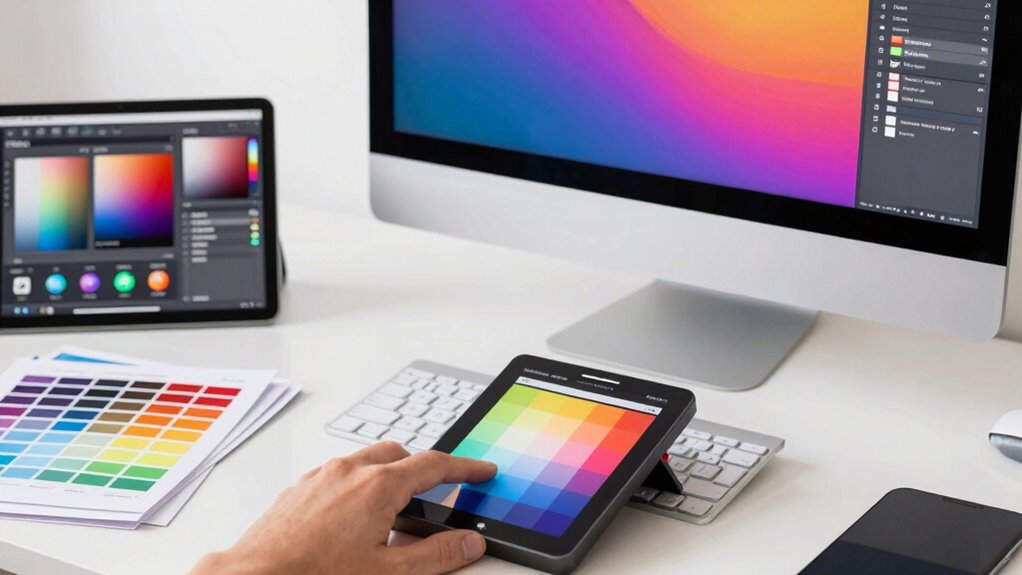
Getting started with ICC profiles in your workflow involves a clear, step-by-step process to guarantee accurate color management from start to finish. First, calibrate your monitor to ensure it displays true-to-life colors; this creates a reliable baseline. Next, assign the appropriate ICC profile to your display through your operating system or editing software. When working on a project, embed the correct color profile to maintain consistency across devices. During printing or output, use the profile to match your colors accurately. Always double-check profile calibration periodically to prevent color shifts. Additionally, understanding the Comparative Advantage Principle can help optimize your workflow by focusing on efficiency and resource allocation. Incorporating color consistency across your tools and outputs ensures your designs look as intended in every context. Regularly updating your ICC profiles can also improve color accuracy and avoid discrepancies in your projects. It’s also beneficial to be aware of how different color spaces interact within your workflow to prevent unintended color shifts. Being mindful of monitor calibration ensures that what you see on screen truly represents your final output. By following these steps, you create a seamless color management system that keeps your colors consistent, vibrant, and true to your original intent.
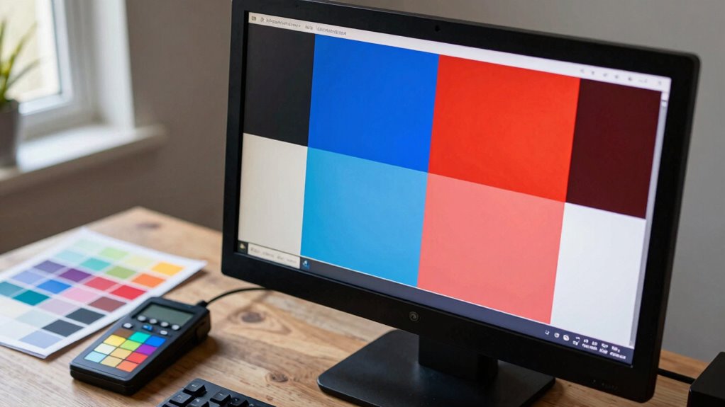
Troubleshooting Color Mismatches Caused by ICC Profiles
Color mismatches often occur when ICC profiles are not correctly applied or calibrated, leading to discrepancies between what you see on screen and the final output. To troubleshoot, first verify your color calibration to guarantee your monitor displays accurate colors. Next, check for profile mismatch issues by confirming the correct ICC profile is assigned to your device or file. Adjust color settings in your editing software to match your calibrated profile. Additionally, inspect your print or output device’s profile to prevent unintended color shifts. Understanding the importance of consistent profiles can help ensure color accuracy throughout your workflow.
Color mismatches arise from improper ICC profile application or calibration, causing on-screen and final output discrepancies.
- Guarantee your monitor’s calibration is recent and accurate
- Confirm the correct ICC profile is assigned at each workflow stage
- Reassign or update profiles if mismatches persist
- Use soft-proofing tools to preview how colors will appear in the final output
Frequently Asked Questions
Can I Create My Own ICC Profiles Without Technical Knowledge?
Yes, you can create your own ICC profiles without extensive technical knowledge by using DIY profiles tools. These user-friendly software options guide you through simple calibration steps, making it accessible even if you’re new to color science. Just follow the instructions carefully, capture your calibration data, and generate a custom profile. This way, you get tailored color accuracy without needing deep technical expertise, streamlining your workflow.
Are ICC Profiles Necessary for Digital Screens or Only Printing?
You don’t need ICC profiles for digital screens unless you want precise color accuracy. While screens display colors differently, profile compatibility guarantees your device’s color output stays consistent. Without profiles, you risk mismatched colors, especially when sharing work across devices. So, if maintaining color fidelity across screens matters to you, using ICC profiles is a smart choice—otherwise, they’re more critical for printing.
How Often Should I Update or Recalibrate My ICC Profiles?
You should update or recalibrate your ICC profiles regularly to guarantee accurate color. Typically, you should perform profile maintenance and calibration every few months or whenever you notice color inconsistencies. Factors like changing lighting conditions, monitor aging, or new hardware can affect calibration frequency. Staying consistent with calibration helps maintain color accuracy across your digital screens and print projects, saving you time and frustration in the long run.
Do Different Software Programs Interpret ICC Profiles Differently?
Don’t let software inconsistencies throw you for a loop; yes, different programs can interpret ICC profiles differently. While most modern software endeavors for profile compatibility, subtle differences in color rendering may occur. These discrepancies can cause your colors to appear inconsistent across platforms. To minimize issues, stick to reliable, well-supported software and always embed your ICC profiles properly. This way, you keep your color workflow tight and predictable.
What Are Common Signs That ICC Profiles Are Causing Color Issues?
If you notice color inconsistencies or unexpected color shifts across your designs or prints, ICC profiles might be the culprit. These issues often appear when colors don’t match your expectations or look different on various devices. You might see dull or oversaturated colors, or your images may seem washed out. These signs indicate that your ICC profiles aren’t aligning correctly, and adjusting or recalibrating your profiles can help restore accurate color representation.
Conclusion
Think of ICC profiles as your trusty map on a color journey. Without them, colors can get lost or look different at each stop. By using the right profiles, you’re guiding your colors smoothly from your screen to print, ensuring they arrive exactly as intended. Embrace these profiles like a seasoned navigator, and watch your designs sail seamlessly across every device—no matter where or how they’re viewed.