
To get accurate color matching when printing art, start by calibrating your monitor regularly to guarantee it displays true colors. Use consistent color profiles like Adobe RGB or sRGB throughout your workflow, and choose paper that suits your artwork, as paper affects ink absorption and color depth. Pay attention to complementary and analogous color schemes to enhance harmony and contrast. Keep experiments minimal by refining settings, and if you continue, you’ll discover even more tips to perfect your prints.
Key Takeaways
- Regularly calibrate your monitor with specialized tools to ensure digital colors accurately represent printed output.
- Use consistent color profiles, such as Adobe RGB or sRGB, to maintain color fidelity across devices.
- Choose appropriate paper types that complement your ink and affect final color appearance.
- Apply color theory principles, like complementary and analogous colors, to create harmonious and striking prints.
- Conduct test prints and adjust settings based on observed discrepancies to refine color matching before final output.
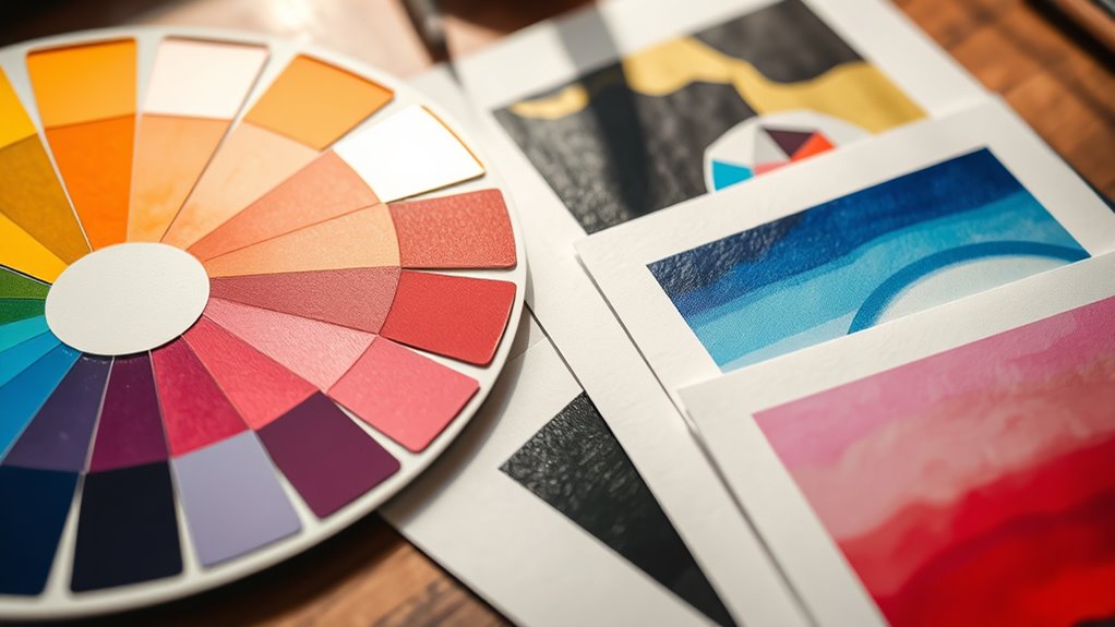
Choosing the right colors can transform any outfit or space, but it often feels tricky to get it just right. When it comes to printing art, color matching becomes even more critical because what you see on your screen might not match the final print. To get it right, you need to understand the basics of color theory and how digital calibration plays a role in achieving consistent results. Color theory helps you grasp how colors interact, complement, or contrast, guiding your choices for harmonious designs. Knowing the color wheel, for instance, allows you to select colors that work well together, whether you’re aiming for a vibrant or subdued look. Complementary colors, which sit opposite each other on the wheel, create striking contrasts, while analogous colors, next to each other, produce a more unified, harmonious effect. This understanding prevents your prints from looking mismatched or dull.
Digital calibration is equally essential because screens and printers interpret colors differently. Your monitor might display colors vividly, but the printer could produce a softer or different hue due to calibration issues. By calibrating your digital devices regularly, you ensure that the colors you see on your screen are as close as possible to what the printer will produce. This process involves adjusting your monitor’s brightness, contrast, and color settings, often with specialized calibration tools, so every project starts with a reliable color reference. When your digital calibration is accurate, you minimize surprises and reduce the need for multiple test prints, saving you time and material costs. Additionally, understanding color profiles and working within a consistent color space, such as Adobe RGB or sRGB, helps maintain color accuracy throughout your workflow.
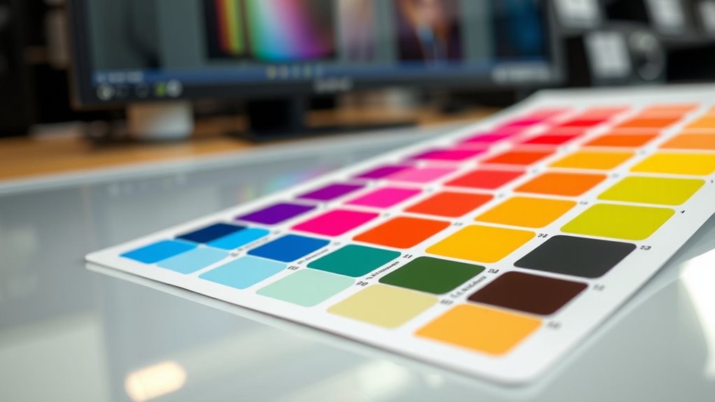
Another key aspect is understanding color profiles and working within a consistent color space, such as Adobe RGB or sRGB. These profiles help standardize how colors are rendered across devices and print processes. Before printing, always convert your files to the appropriate color profile for your printer, ensuring color fidelity. Also, consider the type of paper you’re using, as different surfaces absorb ink differently, impacting how colors appear once printed. Using the right paper and maintaining consistent calibration across your devices creates a predictable workflow, making color matching much easier.
In short, mastering color theory gives you a solid foundation for choosing colors that will look good together, while digital calibration ensures those colors stay true from screen to print. Combining these strategies allows you to produce artwork with accurate, vibrant colors that match your vision, giving your prints a professional finish every time.
datacolor Spyder – Monitor Calibrator for Graphic Designers, Photographers, and Content Creators, Shows You True Colors, Works on OLED Monitors & LED Screens, Easy-to-Use Color Calibration Tool
Color “Surprises” Are a Thing of the Past: Datacolor’s exclusive DevicePreview TM Beta feature simulates what your photos…
As an affiliate, we earn on qualifying purchases.
As an affiliate, we earn on qualifying purchases.
Frequently Asked Questions
How Do I Choose the Right Color Profiles for My Print Project?
To choose the right color profiles for your print project, start by selecting a color space that matches your target output, such as Adobe RGB or sRGB. Use consistent profiles across your workflow to guarantee color consistency from editing to printing. Always check your printer’s recommended profiles, and do test prints to verify colors match your expectations. This approach helps maintain accurate color reproduction and a professional finish.
What Are Common Color Mismatches During Printing?
You often encounter color mismatches like color bleed and ink smudging during printing. Color bleed occurs when ink spreads beyond intended areas, blending colors unintentionally. Ink smudging happens if the ink isn’t drying properly or if paper quality is poor. To minimize these issues, verify your printer settings are correct, use high-quality paper, and handle prints carefully while they dry. Properly managing these factors helps achieve sharper, accurate colors.
How Can I Calibrate My Monitor for Accurate Color Matching?
Think of your monitor as a painter’s palette—calibrating it guarantees the colors you see are true. You should use a hardware calibration device for precise monitor calibration, which helps maintain color consistency across devices. Follow the calibration software’s instructions, adjust brightness and contrast, and set your color temperature to standard (6500K). Regular calibration keeps your colors accurate, so your printed art matches your digital vision perfectly.
What Printing Techniques Affect Color Accuracy?
You should consider how printing techniques impact color reproduction and ink absorption. Digital printing offers precise color control, while offset printing provides high consistency for large runs. Screen printing can cause color variations due to ink absorption differences on textured surfaces. Choosing the right technique depends on your project, as it directly influences color accuracy, ensuring your artwork maintains its vibrancy and detail across different printing methods.
How Do I Handle Color Differences Between Digital and Print?
To tackle color differences between digital and print, start by syncing your setup with smart strategies. Make sure monitor calibration keeps your colors consistent and accurate. Use proper color conversion techniques when preparing files, converting RGB to CMYK carefully to preserve hues. Regularly compare digital previews with printed samples, adjusting as needed. This proactive approach helps you produce prints that perfectly match your digital design’s vibrant vision.

BenQ SW242Q 24-inch 2K 90W USB-C 16:10 Photographer MacBook/Windows Compatible Monitor, 99% Adobe RGB, 100% sRGB, Hardware Calibration, 90W USB-C, TUV Anti-Reflection Cert., 16-bit 3D LUT, HDR10
BENQ AQCOLOR TECHNOLOGY: 99% Adobe RGB/DCI-P3/Display P3, Delta E ≤ 1.5, 10 bit color depth, 16 bit 3D…
As an affiliate, we earn on qualifying purchases.
As an affiliate, we earn on qualifying purchases.
Conclusion
Don’t let worries about perfect color matching hold you back. Remember, slight variations can add character and uniqueness to your printed art. Trust your eye and experiment—practice makes perfect. Even if colors don’t match exactly, your artwork will still look stunning and convey your vision beautifully. So, relax and enjoy the process. With these tips, you’ll gain confidence and create prints you’re proud of, no matter the final color outcome.

Canon 7981A004 Photo Paper Plus, Matte, 8-1/2 x 11 (Pack of 50 Sheets)
Excellent photo results with vibrant colors.
As an affiliate, we earn on qualifying purchases.
As an affiliate, we earn on qualifying purchases.

Calibrite Display 123 Monitor Calibration Colorimeter for Photo Editing and Color Accurate Viewing, Easy 1 2 3 Software Workflow, USB C Connection, and Before and After Check, Supports 2 Displays
SPECIFICATIONS: Monitor calibration colorimeter with Easy 1 2 3 software workflow, USB C connection, compact body approx. 34mm…
As an affiliate, we earn on qualifying purchases.
As an affiliate, we earn on qualifying purchases.